Torrent Brewing Co.
January 2025
Brand Identity
Logo Design
Visual Identity
Web Design
Print & Packaging
Adobe Illustrator
Adobe Indesign
Adobe Photoshop
The Challenge: Refresh the brand identity of a local brewery to capture its bold, community-driven spirit while honoring its rustic, industrial roots.
Located in downtown Ames, Torrent Brewing Company is a gathering place built on strong community ties, local pride, and handcrafted beer. Inspired by the fast-moving waters of the Skunk River and Squaw Creek, the new identity blends industrial strength with organic flow, creating a brand that feels both grounded in tradition and full of forward momentum.


Located in the heart of downtown Ames, Torrent Brewing Company is more than a taproom, it’s a gathering place built on bold flavor, local roots, and strong community ties. Named after the fast-moving waters of the Skunk River and Squaw Creek, Torrent channels the spirit of energy, movement, and connection. The brewery is constantly evolving, offering a rotating selection of handcrafted beers that reflect its creativity and momentum. As a staple in Ames, Torrent needed a refreshed identity that could match its dynamic spirit while honoring the rustic, industrial charm that defines its space and story.
Context
The rebrand set out to capture the duality at the heart of Torrent Brewing, strength and movement, community and craft. The goal was to develop a brand that felt grounded in tradition yet forward-thinking, just like the brewery itself. Drawing inspiration from natural elements, the flow of water, and the grain that fuels the brewing process, the visual system needed to reflect Torrent’s namesake and its local pride. The tone is casual, confident, and inviting, designed for beer lovers, first-time visitors, and loyal locals alike. Every design element was built around one core idea, brewing connection.
Strategy
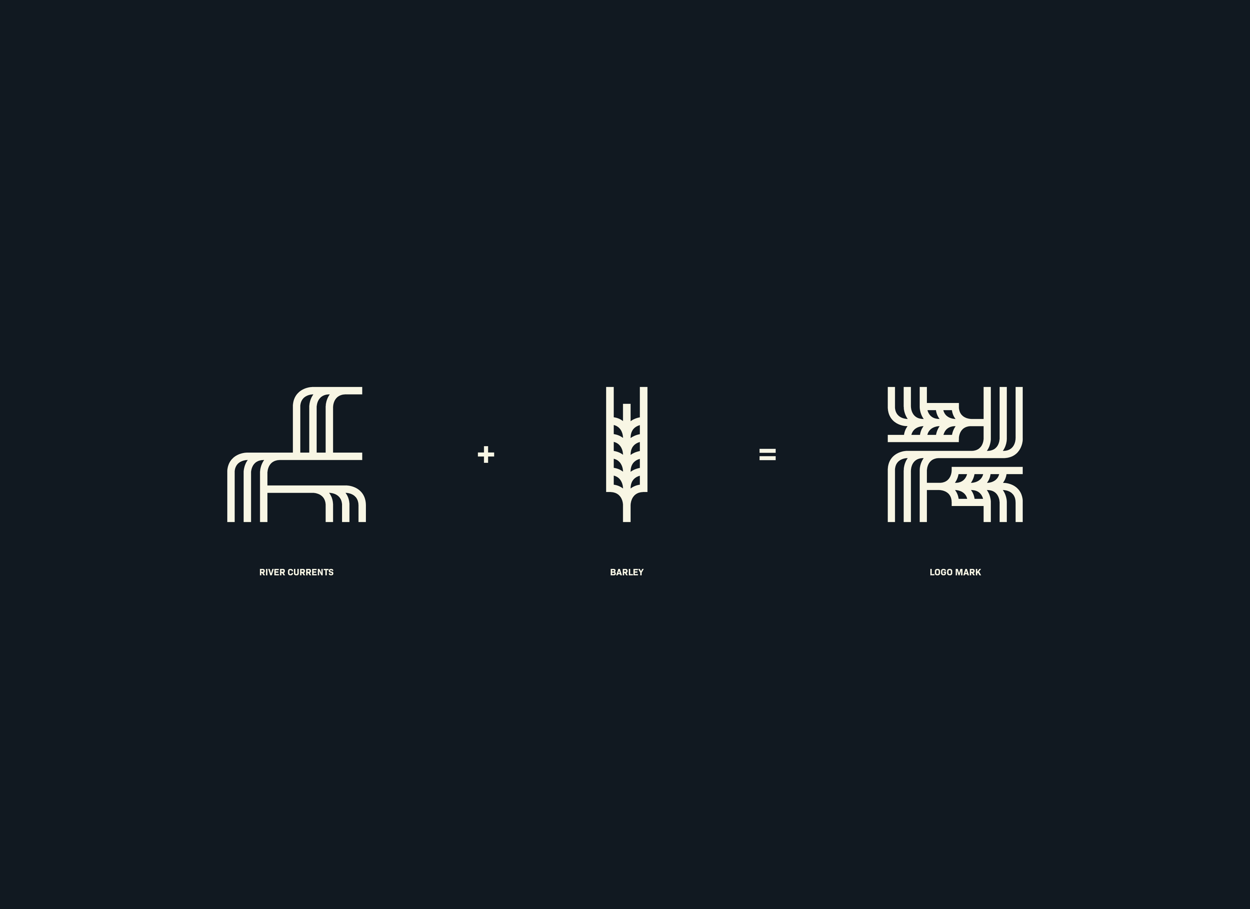
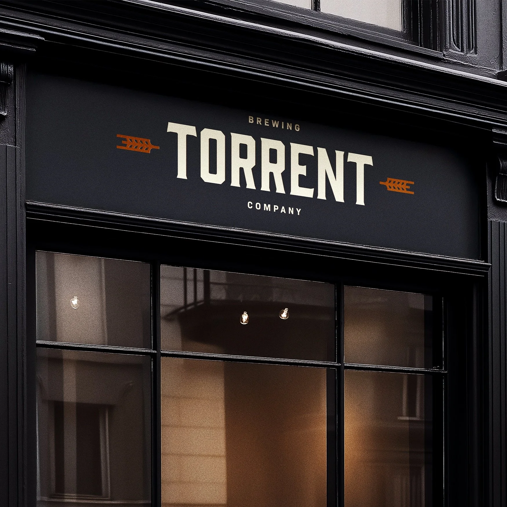
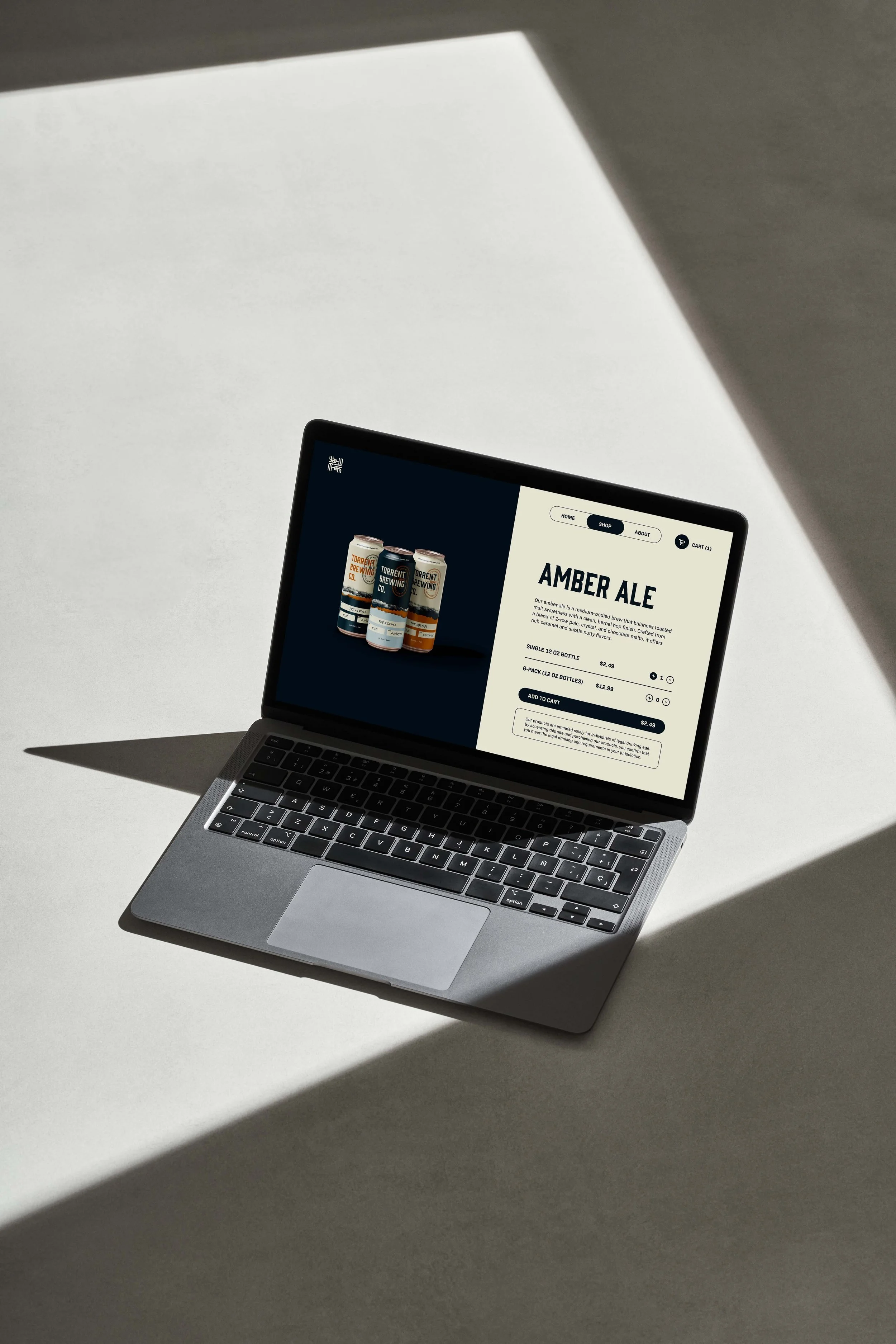
The new identity centers on a modern logo that merges Torrent’s industrial edge with organic flow. Clean geometric lines represent the rivers that shaped Ames, while flowing curves suggest motion and togetherness. A barley icon nods to the brewing process and adds a handcrafted feel. The primary typeface, GIN, gives the brand a bold, rustic presence, balanced by the clean legibility of Bio Sans. The color palette, featuring Midnight Blue, Copper, Current Blue, Foam, and White, evokes both the warmth of a local bar and the cool movement of water. These visual elements come to life across merchandise, signage, beer packaging, tap handles, and social media, building a cohesive identity that’s as inviting and bold as the beer it serves.